

The Nonsense Resumes!
Comrades! This is the second in our periodic series on game design. Today we focus on maps and how they can help make your game better. We’ll also be talking about the design pitfalls indie developers fall into once they realize they have a game but no good mappers.
If you want to see the first part in this series, on Dialogue Design, just click on this strangely coloured text.
Get That Crap Outta Here
So the first thing to specify when doing map design is that every game is different and you will throw out your early work.
I cannot stress these two facts enough. In Pandemonium, the oldest map that is still in the game as of Prototype 3 is Breanne’s Pit Stop. This map has received some improvements but follows the same basic layout. It is approximately the 15th map I created (depending on whether or not you count prototyping maps never intended for the game). I designed the Dimensional Trap Basement and several nearby areas but threw those out after I solidified the design philosophy. All of the early maps are gone, and I don’t miss them – they weren’t as good as the new ones!
I also can’t tell you explicitly how to make maps for your game. Every game is different, and the map must represent this. Games which have different mechanics call for different design. Design follows trends, and maps that made sense in times past no longer do. You must develop your design philosophy as you go, and get used to throwing out old stuff once it becomes apparent that it sucks.
Some Background Info
Pandemonium: The Adventure makes use of Tiled to create maps. It’s a decent quality utility that has pretty much all of the features the game needs. Automap is handy for developing the tree coverage and I’ve managed to rig some depth stuff into it using the layer properties and my own code.
Most importantly, Tiled allows for export extensions. I can export maps directly into .slf format so they can be used in the game with no extra steps. This alone is why I continue to use the editor and probably will for a long time.
Don’t be afraid to use existing third party tools and adapt them to your purposes. Pick them based on how flexible they are. Developing your own tools can take a lot of time and lead to a lot of frustrating bugs, particularly when you’re starting out.
The Pit Stop Example
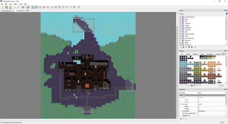
Okay, let’s take a look at the Pit Stop and see if we can figure out what’s good about it.
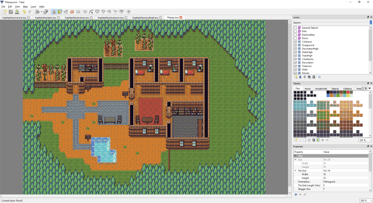
This is what my development environment looks like when making maps. I’ve excluded the object layers and hidden the collision layers. You can generally tell where you can and can’t walk based on walls and fences, so you’re not missing much. Notably, doors are handled differently in the engine since they can be opened and closed by scripts, so they are objects and not tiles.
The Pit Stop conveys several useful parts of my design philosophy. Let’s go through them:
1: No Useless Space
Useless space can be a hard thing to grasp when doing map design. You are walking a fine line between cramped conditions and too much space. You want to keep map density at just-the-right level, and what that level is is based on your judgement.
However, I can show you some tricks. Only about 60% of the map can be walked on. This allows the map to feel bigger than it is. There are some crops off to the north end and some uninteresting fields on the right side that make the area feel larger than it is, but those areas are gated off. The player cannot walk there and does not need to. I have also purposefully not placed any decorative objects on most of those areas. The player will not be wanting to walk over there or wondering what they are missing, since the answer is nothing.
2: Branching Layout
You can quickly access everything in this map within about 5 seconds of entering it if you hold the sprint key. This isn’t always possible when making architecture for a game, and you generally want to use this for areas with no enemies in them. The player is here to do stuff, not to hold down movement keys. Put the NPCs they need to talk to within convenient walking distance! Don’t waste their time!
3: Object Density
There is actually a lot to do on this map, though it is not immediately obvious. You, the player, can examine all three signs, the food shelves, all three bookshelves, and the shed door. Breanne always spawns here to talk to and has a few subquests about here. In Prototype 3 there are about 6 NPCs that can spawn here, two of which are related to the aforementioned subquests. There’s a lot to do in what is effectively two screens of map.
More importantly, all of the extra density is on the edges. Notice that the bookshelves are on the edge of the walkable area, and that the signs do not obstruct the player’s movement area. NPCs also tend to spawn on the edge of the walking area as well.
4: Obvious Path
There is a big, obvious stone path right in the middle of the area leading you to all major points of interest. Yes, the map is only about two screens wide, but that’s not the point. The stone path leads the player’s eyes to where they need to go. If there’s no path someplace, the player will subconsciously not put as much priority on that area. The bottom-middle of the map is an open area with nothing in it, and there’s no path leading there. The player may explore it if they want, but nothing about the map design is driving them to.
Negative Space
Breanne’s Pit Stop rather explicitly does not use negative space. It is a map that takes place outdoors and is intended to be welcoming and happy. Negative space is the area around the objects you are showing in the game. If you’re a pedant, you can read the wiki page on it.
Negative space allows you to balance the appearance of the room. This depends on your design philosophy and what feelings you want to evoke in the player. An area with no negative space feels open and optimistic (in general) while an area with high negative space feels claustrophobic.

Here’s a screenshot from Prototype 3’s Corrupted Bee Hive area. The purple stuff is corrupted honey. A very nasty cutscene takes place here if you are defeated in the lower bee hive. I don’t want to spoil it, but notice the use of negative space. The player is centered and there is nothing to draw the eye away from the action. The room is small, there is nothing outside, and it’s claustrophobic. Exactly the emotion set I want the corrupted area to evoke!
To accomplish this, I use a blackout layer and place it over the tiles.

This is the same map without the blackout. Notice that the area outside the map is more distracting to to the eye? The blackout takes time to develop and required a special tileset, but I think it was worth it.
The Counter-Example
(Please note: I don’t mean to pick on BrandyGang here. You make good games, comrade! But, your map design could use a lot of work.)
In The Hero We Need, which is a game you should totally play and support, the first area that the player gets to actually move around in shows a bunch of good examples of what not to do during map design. Here’s some screenshots:
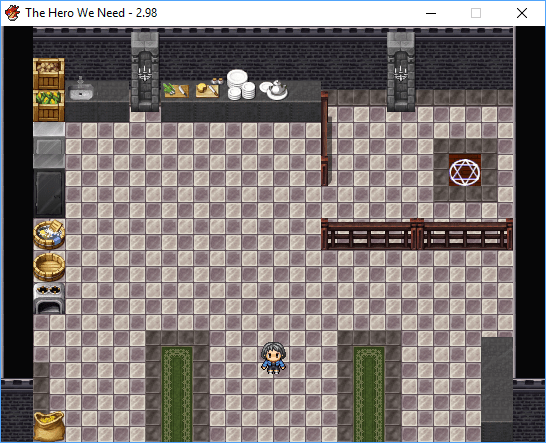
This is the kitchen area just north of where the player first is able to move around.
Nothing in this room is examinable. It has one NPC the player can talk to, and indeed, has to talk to to advance the story. There is no negative space here. The area is also unrealistically large, with a huge open floor that has nothing in it in the middle of a kitchen.
The reason why is very obvious. The developer has a fixed screen size in RPG Maker and felt he had to use the whole screen up, so he made the map the same size as the screen and did not use negative space.
There’s also not much pathing. Fortunately the doors are clearly delineated by the carpets (carpet in a kitchen is asking for trouble…) but the fence acts as a choke point without a change in flooring. I can see that the teleporter is important but there’s a bunch of visual fluff on the edges of the map that is unimportant but has the same flooring. Should I examine it? The answer is no.
That’s before we get to the other questions. Why is there an inter-dimensional teleporter in the kitchen? Why is there a fence roping off said teleporter? Why is the kitchen right behind the throne room?
These questions might seem a little unfair, and they are – individually. As a whole, they stack up to produce an unrealistic experience that nags at the player. None of this stuff matters, this is not a place filled with people who have problems to get invested in. It’s fake! It’s all fake! You gotta tell them! They’ll be breeding us like cattle! Soylent Green is people!
Okay, so let’s take a look at this:
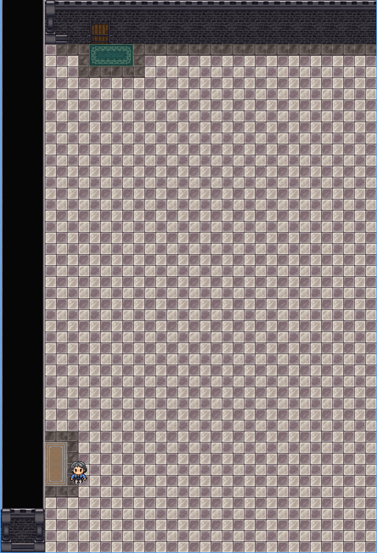
I honestly don’t understand this map at all. It’s a very large, long map that has nothing in it and is bordered irregularly. More important is that it never has anything in it! At the top is a door that leads to a garden with an NPC in it. Why couldn’t the throne room door just lead directly to the garden?
If the purpose of this map was to allow the player to exit on the right side of the throne room and enter the garden from the bottom, why is the map 2.5 screens tall? Couldn’t the same goal have been achieved with 0.5 screens?
I just want to reiterate that I am not picking on BrandyGang deliberately, his example just happens to be one of the more recent ones I’ve seen. A lot of games do this. Even games that are ostensibly professionally made routinely fail the map design test. Map design is hard!
How To Fix It
Because I’m not a (completely) miserable sort, I’m going to provide some advice on how to fix this issue fairly quickly, if just for this example.
Have the exit to the throne room lead south and only south. It leads into a hallway which has doors that lead to the kitchen, a teleporter room, the garden, the offices, and the exit. Since the player has to first enter the teleporter room for plot purposes, have an NPC standing in front of said door (to draw the player towards it). Afterwards, have another NPC near the office door (which is the next target for plot reasons) and so on until the player is expected to leave the corridor. The corridor’s exit to the outside world should be larger than the other ones, indicating it is more important. The other rooms can contain extra NPCs, stuff to examine, or just be locked off until the player needs to go there. This also prevents the player from having to cross unnecessary rooms to reach necessary ones, following the branching design pattern for safe areas.
If you’re making your own game, keep these ideas in mind! Go back over your maps and think about how the player gets through them, what the player’s objectives are, and where you want to direct the player’s attention.
Out With the Old
So, here’s an example of a map that got cut from Prototype 3, and what I replaced it with. Let’s take a look.
So this map has a number of issues. First, no negative space. Second, no obvious pathing (the player enters from a stairway in the bottom right of the house, but the exits are to the south, north, and east. Their immediate path leads west!). Third, it’s very claustrophobic and cluttered. Enemies tend to get caught on edges a lot. Where is the player’s attention meant to be drawn? Argh!
Here’s what I replaced it with.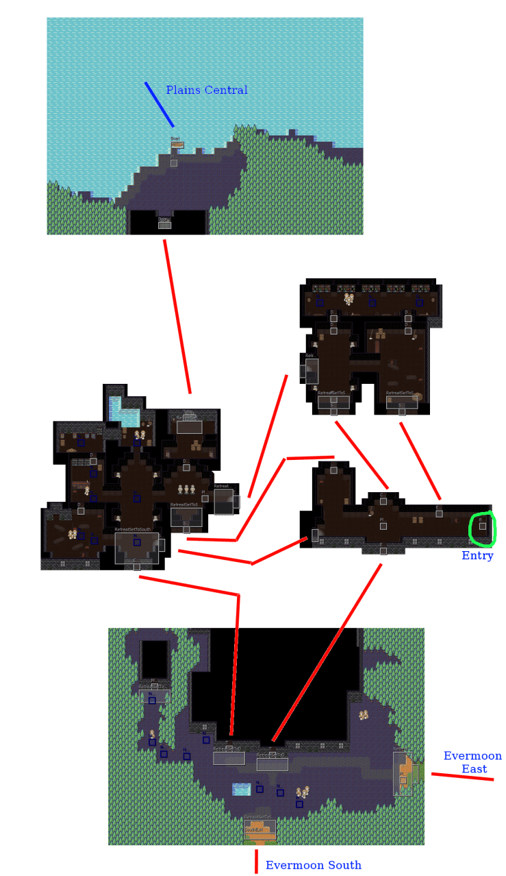
Here have a collection of five maps that constitute roughly the original, though you can’t walk around the outside edges of the manor anymore. The use of negative space is a lot better, as the interior maps are claustrophobic and the exterior maps have trees and moving space. The player has just escaped a claustrophobic dungeon and will want to run into the forest ASAP.
Also, the path dependency is a lot more obvious. Because the maps are split up, the correct direction is the one that is most prominant and has no enemies in it. The southernmost map is the correct exit, and the path subtly guides the player to the east by having a clear path and also an enemy patrol (those are the blue path nodes you see) that crosses the south exit. The player can skirt around them but both the south and east exits are equally viable. The west building is a dungeon that becomes important later in the chapter and the player is discouraged from it by a tight tree path, no clear floor leading them there, and an enemy patrol smack in the middle of it.
The northern exit leads across the lake and is for advanced players. You must acquire the boat oars from the basement dungeon to use it, and while there are no enemies in a direct path to the boat from the entrance, players who are just exploring will probably be driven in the other directions by the patrols they find. The circuitous nature of the cramped interior means the player can avoid the patrols if they know what they’re doing but will otherwise be sent packing, exactly in the direction I want them to go.
There’s also more treasure, objects to examine, and better enemy patrol paths than the original version. Overall these maps are much nicer and do a better job of guiding the player.
Strategic Design

Now, let’s take a look at the strategic connectivity of the maps. Here we can see the general layout of Chapter 1, in a map made by Stinkehund. (Please note the corgi, that is crucial to understanding the game!)
In order to complete the chapter, the player must go to the Quantir Mansion located in the top right corner. This area is filled with tougher enemies that are hard to avoid. I really, really want the player to go to the Trading Post on the left side of the map, helpfully labelled “Objective” here. This is where they meet Florentina, their second party member who both makes the fights a lot easier and unlocks a lot of content. She’s also a total jerk!
Now, I’ve decided in Chapter 1’s design to make it as nonlinear as possible. It’s actually possible to complete the chapter without meeting any of the major NPCs or seeing any of the major areas. This is to make the world feel more alive. I intend Chapter 2, 4, and 5 to be much more linear, but 1, 3, and 6 are very nonlinear. How can I make the player go where I want them to without forcing them there?
First, the end of the starting dungeon gives you a map and explicit instructions to go to the Trading Post. Second, the normal paths leading out of the starting point (the south and east paths) all loop very close to the Trading Post on their way up north. The advanced path which requires the Boat Oars item loops by Breanne’s Pit Stop, and Breanne explicitly tells the player to go to the Trading Post. If that wasn’t enough, the Slime TF and Alraune TF deposit the player fairly close to the Trading Post once they’re done. The Bee TF places Mei in the top left corner, but this still takes her by Breanne’s Pit Stop or south along the path to the Trading Post.
Lastly, if that wasn’t enough, the Werecats are located along the northern path leading to the mansion. If Mei is not level 2 and has not learned Quick Strike (which she learns in the cabin north of the Trading Post) then she will basically be unable to beat the Werecats in combat, as they are fast, numerous, and deal a lot of damage to an unprepared player. The Werecat TF then deposits her square in front of the Trading Post, courtesy of Nadia.
Everything about the world layout is leading you towards Florentina without forcing you there. Advanced players can skip events to save time or to see what happens when they encounter events without Florentina or how that changes later chapters. Almost everyone who plays Chapter 1 to completion will probably have met Florentina. Some won’t, because they’re weird, but most will. That’s the goal.
Conclusion
This post is really long and I still don’t know how to end articles. Go away.

The details of the routing tricks used to lead the player to Florentina are especially interesting. Here’s to the future Prototype 3!
One thing worth pointing out is that an RPG Maker-style game should generally have smaller maps than those of games with seamless combat and exploration, because the game doesn’t need large environments to support combat. You only really need a map large enough to fit all your interactive elements and decorations, and provide the desired sense of space. Even areas that are supposed to seem large can be fairly small, if spaces that are supposed to seem cramped are even smaller.
LikeLike