All of the UIs are now updated to the new standard. The update is “Complete” though I have lots of alignments to set, bugs to fix, help text to set, you know. Coding stuff.
Next week on Monday, I will put out a public beta with as much as I can get done between now and then. This is to gather feedback and suggestions for further improvements to the UI, such as options people want, size changes, and the like. After that, I’ll be fixing as many bugs as I can before the end of December, at which point the UI update goes live and I start working on the Steam release.
Say Hello to our Newest Team Member
That’s right, our newest team member is the world-famous SARS-CoV-2! Currently working with artist Stinkehund, I expect this will cause Slitted Eye to be delayed a while because holy shit this new team member is causing serious problems.
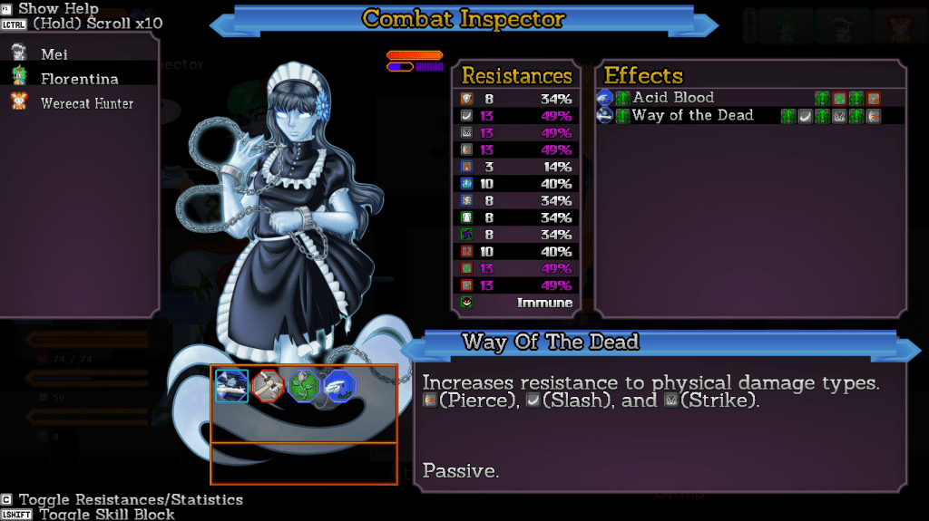
All of the UIs are completed except Combat, and the additions to the Skills UI.
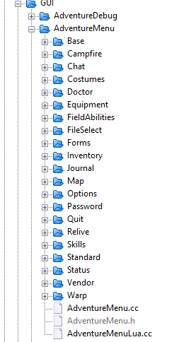
Dig the code organization, the capacity for expansion.
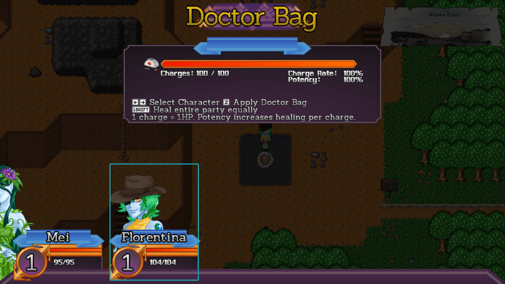
The Doctor Bag’s UI now uses the existing party positions to represent who is being healed, and shows the bonuses your doctor bag has. That wasn’t shown anywhere else on the UI so some people questioned if it was even real.
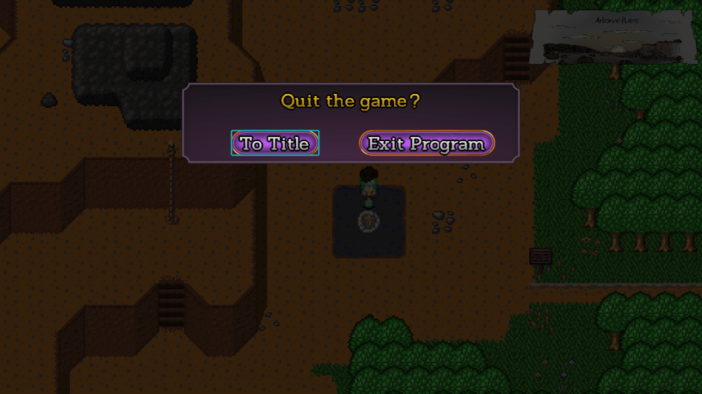
One of the more exciting and interesting UIs, the Quit UI is now in line with everything else.
Amusingly, the Quit UI was the one UI I never touched or updated since it was made. It was using deprecated fonts and stuff. Nobody noticed!
The Map and Warp UIs were also updated, but are visually identical to their previous versions. I just moved and reorganized the code.
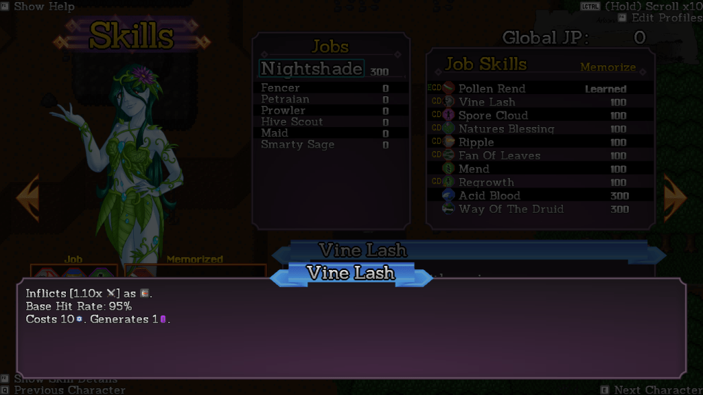
The Skills UI now has a much nicer new layout, with new icons to indicate equipped skills and Class Default skills. The UI also places your current class at the top of the jobs list.
The skill descriptions deliberately use a larger font to improve readability. I have to make a new set of icons for the new font size, though.
Just like with the Inventory and Equip UI, pushing the F2 key opens up a description window to give more details on the skill. This is much better than the previous method of keeping the descriptions in the same window and using a different font, as I can now cram all the detail in a window you don’t have to look at.
I’m still working on the Profiles UI. Profiles are a new addition in this update. You can make a preset group of memorized skills, and then save them as a profile. If you switch jobs later on, that job will automatically use the set of skills that you set it to – including in combat!
More on that when it’s done. After this, all that’s left is the Combat UI and we’re ready for release.
I’ve updated the class change UI. This involved reorganizing a bunch of the code, so now all the grids use standardized code. Class changes also use the new property comparison block.
You’ll notice a slight difference in that we’re now use the combat portraits here instead of sprites. While I did write code to miniaturize existing images and render percentages of them, I’ve decided that, to save memory usage, I’ll actually make adorable 90×90 icons. So these are that.
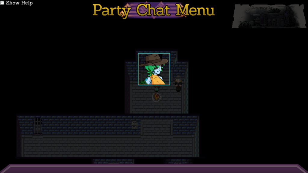
Party Chat UI, same basic deal. The code is now better organized and we use a miniaturized emote, which I will make icons of later.
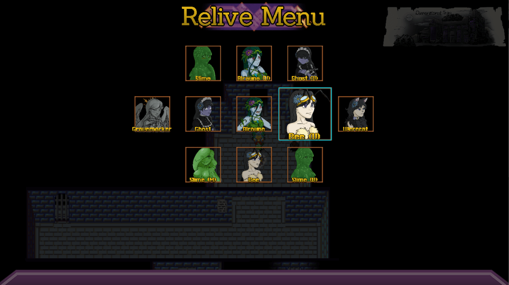
The Relive UI got the same treatment, once again using emotes. Considering the nature of these scenes, I will probably make icons of the TF sequences instead.
Costumes UI. Once again, now using the emotes is much cleaner than using the sprites.
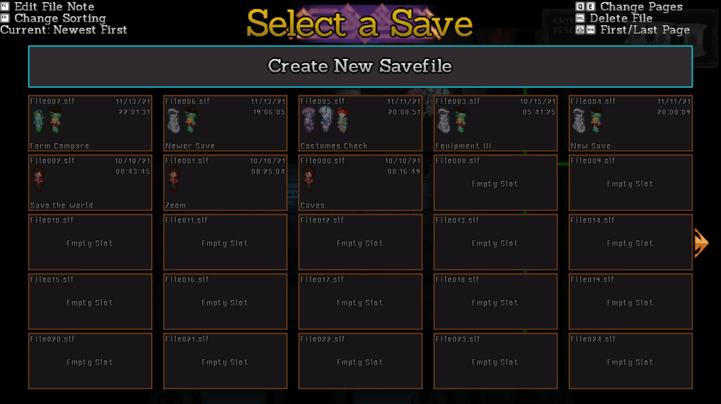
The Save UI is also updated to use a new set of fonts, and to standardized the control information printed at the top. You now also press the shoulder buttons to switch pages instead of holding Ctrl down.
I also updated the password UI, but it’s literally identical in every way to the old version. The code is different and better organized, but visually, it’s the same.
This week, I’ll be rounding off the campfire menu with the Warp UI, which is another grid UI so it won’t take too long.
After that, Doctor Bag UI, Exit UI, and Map UI. These are all the “small” UIs, because the last ones will be the big, scary Skills UI and Combat UI.
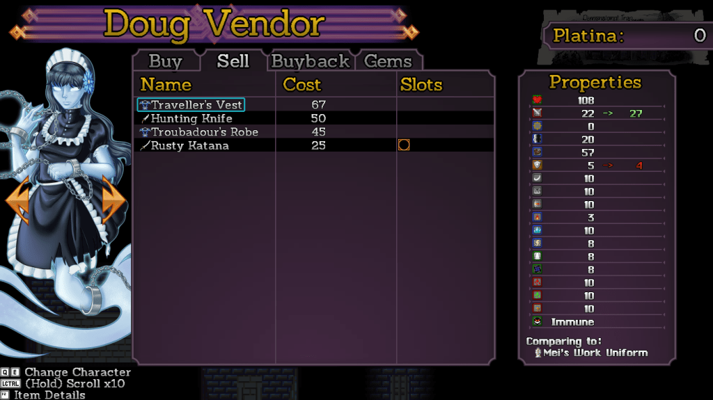
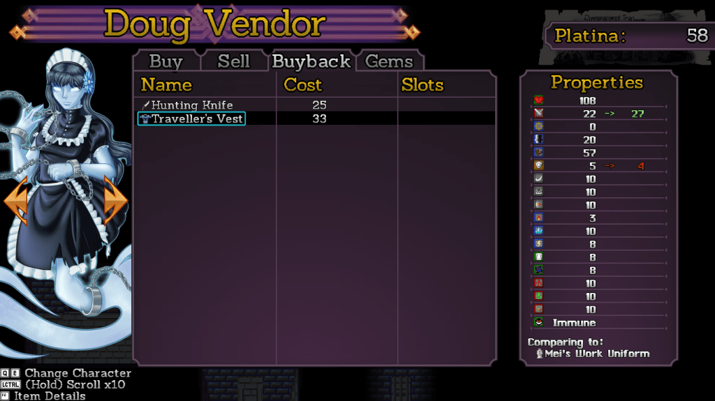
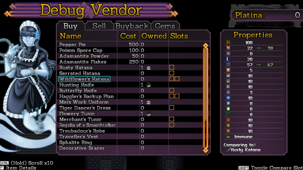
The Sell UI is now complete, borrowing a lot of the same code as the Buy UI. It’s what you’d expect, showing the item’s value and its properties, allowing more details by pressing F2.
Keep in mind the column layouts are subject to change once I talk about this UI to my UI person. And if you’ve got suggestions, now is the ideal time!
Buyback is unchanged, still basically the Buy UI. For those of you not in the know, the game tracks the last items you sold to a vendor and lets you buy them back if you made a mistake. Well that’s this UI. Simple.
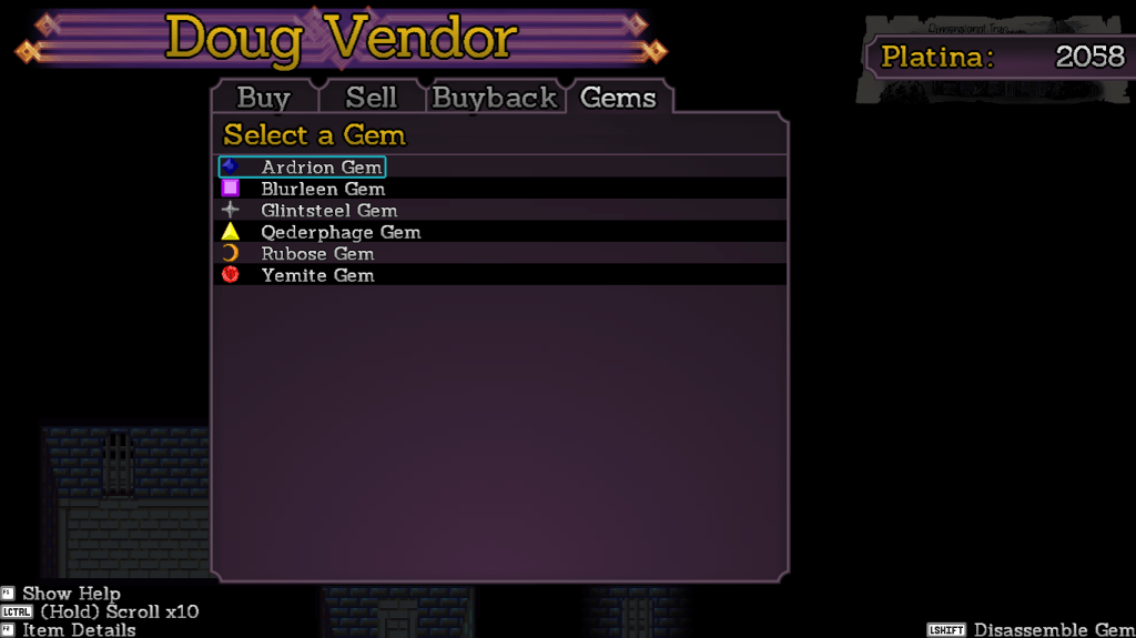
The Gems UI is now totally overhauled. First, you select a gem…
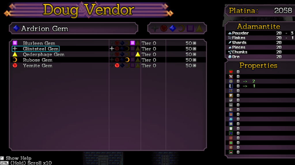
At which point you are brought to the merging screen, which shows costs, property changes, and even the colors of the various gems you own.
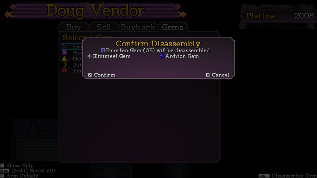
You can also now disassemble gems, returning the original gems but losing any adamantite and money spent in the process. This wasn’t in the old UI, so I had to slap together the code for it. It works like a charm.
This week I’m going to be going over the campfire saving UI and getting all that stuff up to standard. Not much code writing, more like code reorganizing.
First up this week is the main menu, which has shifted formats a little. The menu grouping is now 5×2 instead of 3×3, the listing on the right is now wider so the catalyst information is less cryptic, and the character info is now spaced to handle exactly four characters.
I have also completed the first of the Vendor UIs. Borrowing the concept of putting the description in an F2 subwindow, more space is allowed for the item listing.
The UI now has a much cleaner comparison of properties and even shows how many of an item you have and who has it equipped.
I’m going to hopefully be able to finish the Sell and Buyback UIs very quickly since they borrow most of the layout and code from the Buy UI. The Gems UI will be completely overhauled.
Slitted Eye
According to Stinkehund, she has to make minor stuff to be placed all around the house and give it a lived-in sort of feeling. Hopefully done by the end of the month.
Import VHSs in the 90’s were pretty wild.
Charlotte draws stuff in her crafts room a lot. Sometimes the doodles are masterpieces.
We don’t have an ETA on Slitted Eye yet. I’m hoping to have it out by February, but that’s very tentative and not a guarantee.
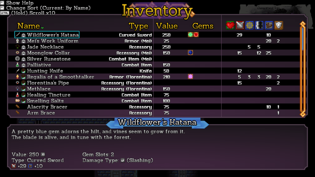
First up this week is the new Inventory UI. The layout didn’t change much, but the assets were redone and everything is now sized correctly since I know exactly how many lines are available for the given font sizes.
I also wrote some dynamic property generators so the descriptions will show the exact stats of a piece of equipment. These are shared with the Equipment UI but the Inventory doesn’t require a keypress to show them, and obviously can show stuff that nobody can currently equip.
If you have any suggestions on changes to this UI, now is the time to suggest them.
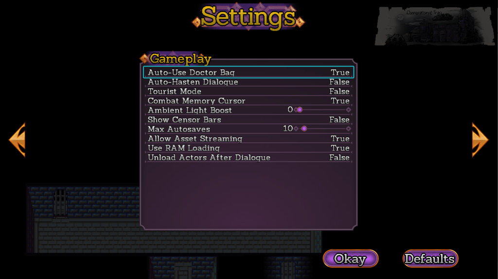
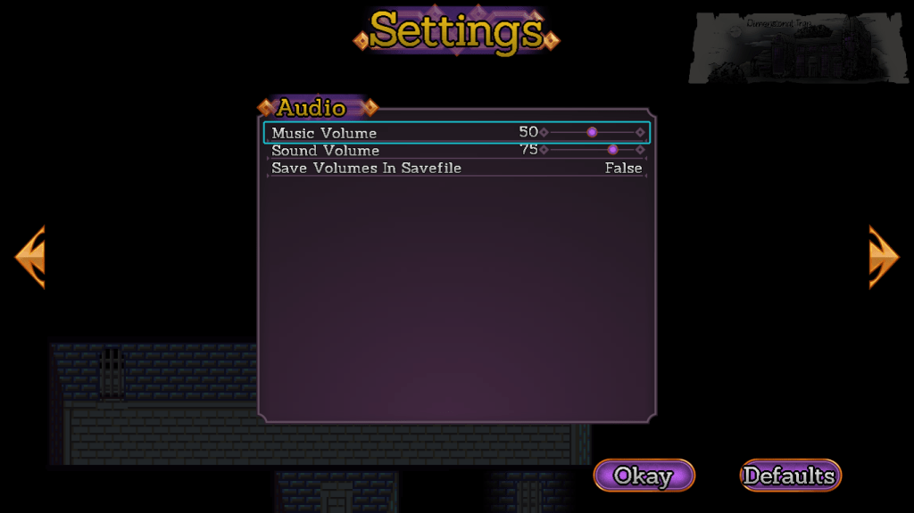
The Options UI has also been redone, standardizing the cursor and sizes with the rest of the UI. There’s also multiple pages now, accessed with the shoulder buttons (Q and E on the keyboard). This means I have plenty of space to add more options if people request them.
Oh but you don’t know what an option does?
Push F2 on an option and a detailed description pops up, telling you exactly what it does without cluttering up the UI.
This won’t prevent people from asking me what Tourist Mode does but it does mean they will look very silly when they do.
The program will also be much more explicit about the fact that changes are pending. If you attempt to press cancel with pending changes, you will receive a warning. You need to use the Okay button at the bottom to actually save the changes.
Most games use this standard for their Options UI but are (usually) more obvious about it. Now Pandemonium is too!
Art Attack!
One of the things about 3D environments is that you need to have junk lying around to make a space feel lived in. So Stinkehund has been making assorted junk to go in Slitted Eye. The models for the entire house and most of the characters are done, we just need to make it look natural.
Sadly, Hund didn’t make the globe texture have a knife sticking in the Soviet Union with red coming out to show the iron curtain. I have been assured that every globe made before 1991 had that decoration but never seen one myself.
I’ve made layouts for most of the UI upgrades and completed the Equip and Status screens.
The Status UI is pretty simple, but now a bit more open to show off the portrait of the character. Everything is now also correctly aligned and has some nice detail flourishes.
The Equipment UI is likewise more open to show off the portrait art. You can also use left/right to select gem slots directly, making equipping them and comparing things easier.
You can push F2 to see details of the item. I put some automation in to generate the properties on the bottom. Important for combat items since their properties usually can’t be described with just statistics alone.
See the comparison on the right and directly equipping gems. The replacement UI is also now in-stride with the other equipment instead of being its own window.
Curious Cat
Links? In my pile? It’s more linkly than you link.
As of now I have “done” the cutscenes I needed to do up until the party forms proper in chapter 2. I want to get the first village done and obviously have the combat outlined before I do a release.
However, the public voted for some exciting UI update action, so that’s my current priority.
Artistry
Remember those goofball artists? The house in Slitted Eye is now done, all we have to do is make the various enemies path around and try to murder you. Which is actually a lot of work so hey, back to the grind.
Artist Chickenwhite got herself a new computer that no longer lags when doing 3D animation. So that’s a nice thing now isn’t it.
As far as coding goes, the third puzzle mechanic is now in, all I need to do is go through every map I’ve made and add clue spawners. So at this point it’s largely cutscenes, dialogue, and combat between me and the release. Speaking of.
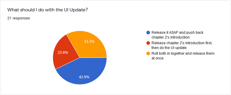
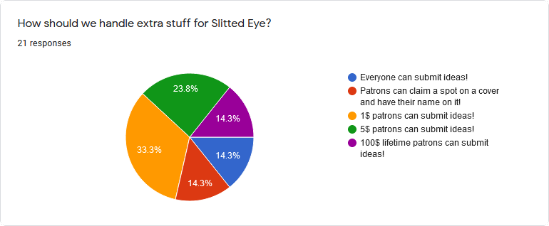
Poll Results
Last week I asked the patron pals what we should do concerning Slitted Eye suggestions and the UI Update. Well here’s your damn results.
This means that I’ll be yelling at our UI artist to get me the last UI pieces and implementing it ASAP. I have to finish a couple things in chapter 2 first, and then I’ll switch over to implementing the UI.
Look at how generous our 5$ patrons are.
Starting today, there will be a patron post that I will link to in each update post where you can submit ideas. If you’d like your name on the resulting piece (should Koops choose to accept it) please be sure to put that in the answer.
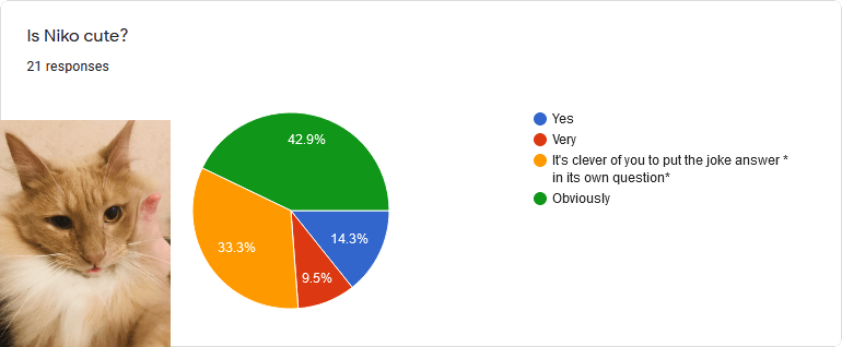
Obviously.
Curious Cat
Way too many links! An unmanageable amount of links!
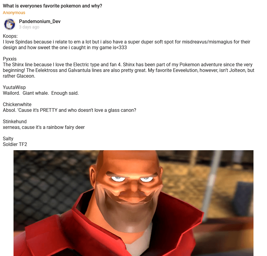
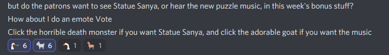
It’s like deliberately tying votes is some kind of running gag with you people. Which means I get to decide and you get to see Statue Sanya this week if you’re a patron. You jerks.
Other Development
The artists are still hard at work on Slitted Eye. It’s coming along very nicely, but likely will not be done in October. There is a bunch of soundwork I’d like to do on it even if the animations are ready, and I want to spend a bit more time polishing this one than String Tyrant got.
I’ve “finished” the second of the big new puzzle mechanics that is going into chapter 2’s introduction. I put finished in quotes because it can always use more polish and bugtesting, but it works and is playable. It’s even kinda fun and the puzzle generator stumps me, the guy who wrote it, every now and then!
This means there’s one more major new mechanic, a few cutscenes, and all of the initial combat (there are three playable party members in the intro!) and then we’re ready to go on chapter 2’s introduction.
Curious Cat
Way too many links! An unmanageable amount of links!